How to Optimize Your Website for Mobile Users
Latest News and Trends • 30th Jun, 15
The last thing that Google wants is to send mobile users to websites which result in a frustrating browser experience, which would damage the promise which they’ve made: to provide users with both helpful and relevant content. It’s in any business best interests to realize that as consumer behaviour is changing, they too are expected to adapt. The first step to doing this would be to build a mobile-friendly website, and infusing your marketing strategy with a very important ‘mobile mindset’.
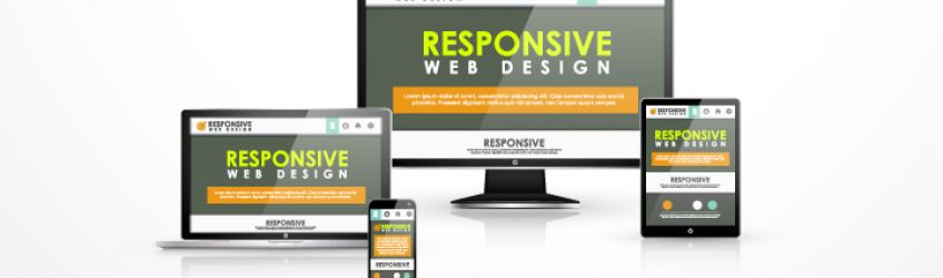
In this modern day and age we’re lucky enough to have access to an endless amount of digital devices. Having access to these multiple devices, consumers now expect the best online experience from all of their digital interactions. The masses now want to be able to accomplish whatever it is they need done using whichever device it is they have at hand. You guessed it – this means that adapting your site to make it look presentable on different sites is simply not enough.

There’s a chance that the metrics which you have established during those desktop days will not translate to the new multi-device world. There are certain things consumers could be looking for, such as a prospect who is visiting the website of a consulting firm. This includes things such as:
- An infographic to show co-workers
- The bio of partners who they are about to meet
- A case study which they could read while they are travelling
To meet expectations it’s necessary for you to design your website so that it will help consumers find the specific piece of information which they are looking for both quickly and intuitively. By giving them a mobile visit which is distracting, time consuming, or just all together frustrating, you’ve already damaged their perception of your brand. Nowadays most people have a more intimate connection with their phone than their desktop, making use of it in almost all situations.
Your main objective should be to help consumers find what they need and do what they want to do quickly and easily. To ensure that your websites are mobile friendly and optimized, here are a few things to note:
- Use large, easy-to-read text
- Use clear images which are large
- Stick to a simple layout
- Use large and mobile-friendly calls-to-action